Winnove Medical
-
Quand j'ai reçu la demande de rebranding des CEO de Winnove Medical, je me suis dit : eux, ils ont des ambitions aussi grandes que l'orthodontie est peu attrayante — c’est-à-dire beaucoup — alors qu’ils étaient encore au tout début de leur projet. Ils n’avaient pas vraiment d’idée précise de ce que leur marque devait devenir, ni pour qui. Ils savaient seulement que leurs innovations offraient les meilleurs soins du marché possible.
-
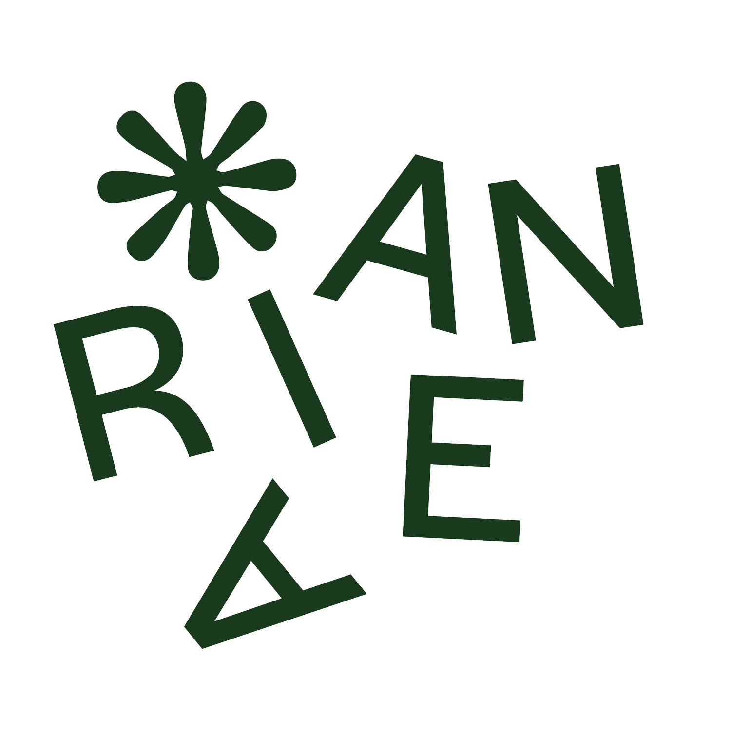
For some, the symbol developed for the brand evokes a cross multiplication with a plus, for others it symbolizes renewal, the big bang, the supernova. Whatever the interpretation of this proprietary emblem, the logo's graphic design and its visual territory were conceived to visually and emotionally convey the brand's key values.
→ Quality through elegance
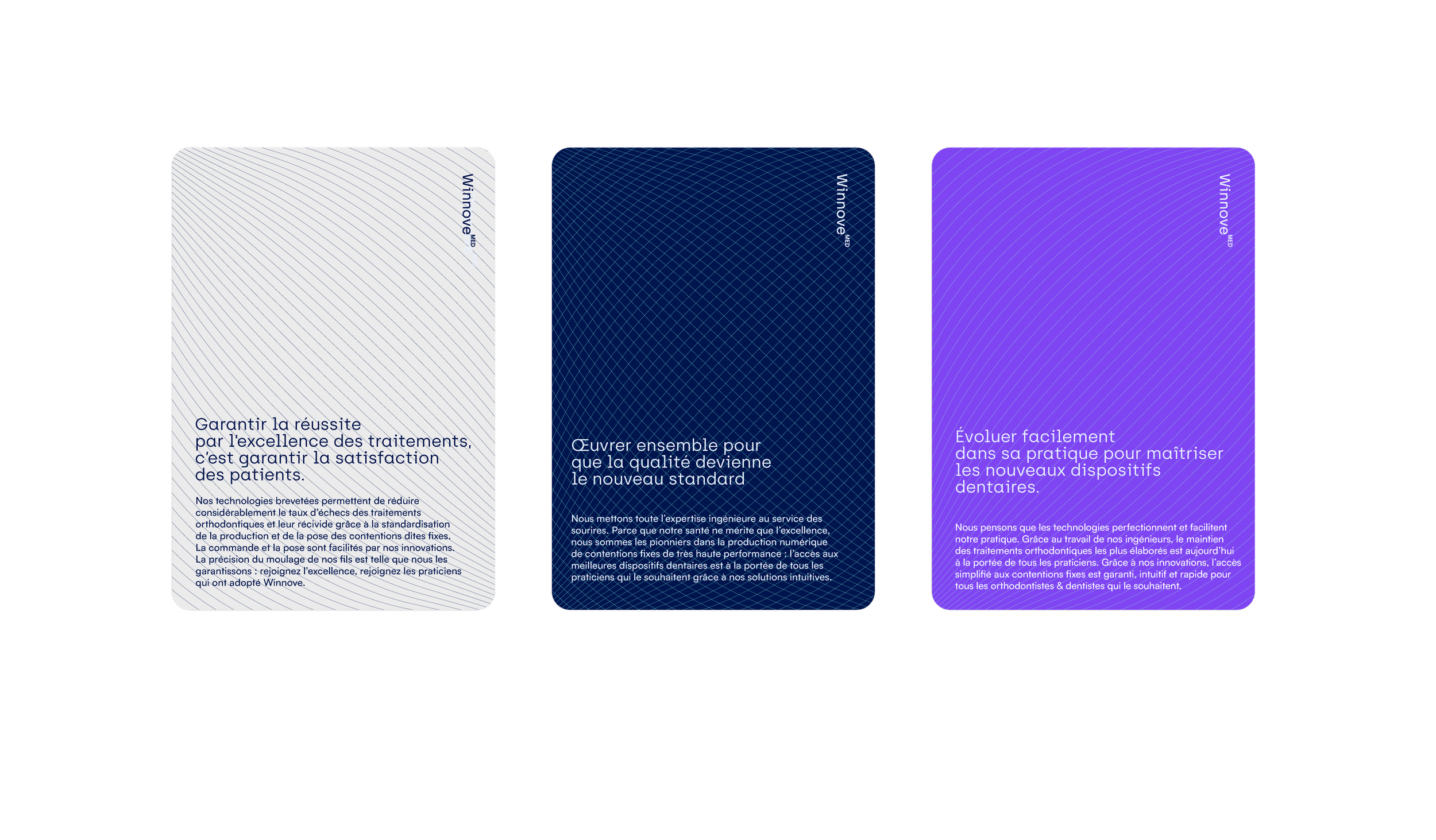
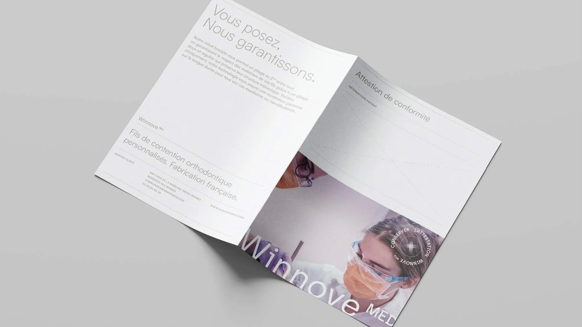
The notion of quality, central to Winnove MED, is conveyed by the finesse of the graphics and their contrasting colors. These premium codes, borrowed from luxury houses, are used to visually translate this notion of excellence.→ Avant-garde through trend
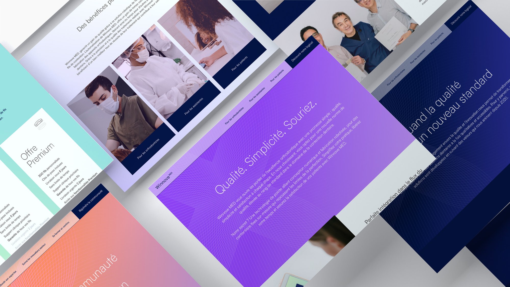
Innovation is represented by the use of bright colors optimized for screens (RGB), aligned with current graphic design trends that favor colorful and luminous universes. This choice of colors associates the brand with a contemporary positioning and opens its universe to younger practitioners.
→ Accessibility through geometry
The repetition of graphic assets creates a pattern, a proprietary element in the development of a brand's visual universe, and mainly evokes the idea of process multiplication through Winnove MED's patented robots.
-
Logotype
Pairing typographique
Palette de couleurs
Motifs
Banque photos
Brandbook
_
Web Design
Packaging
